Saturday, February 26, 2011
Sunday, February 13, 2011
The Secret vs. The Book of Kells.
The secret of Kells is a movie that takes a lot of visual cues from the Book of Kells, one of the scenes where this is extremely obvious is when the little boy and the faerie girl are jumping around the book. This part makes the cler connection between the book and the movie. The movie was interesting because it animated the designs and made them look as though they were real growing parts of nature rather than just drawings flat on a page. Another thing I noticed they used a lot in the secret of kells was the small delicate details. That is something you can clearly see in the actual book of Kells. The second screenshot I have here is particularly interesting because of all the organic shapes found in it that mirror the book.
Saturday, February 5, 2011
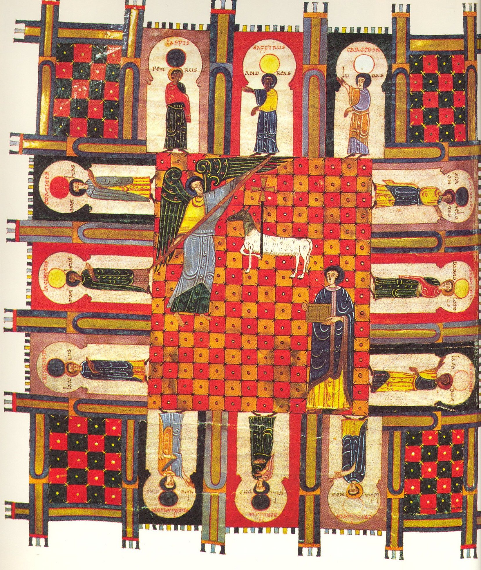
Spanish Manuscripts
Looking at all the bright bold colors in the Spanish manuscripts made me think of bright bold tiles used in Spanish inspired houses. I really like the feel of the tiles, with the heavily saturated tones. They are flat just like the manuscripts and I can see the style carrying through. Another aspect of it that is clear throughout is the repeating patterns obvious in both.

Tuesday, February 1, 2011
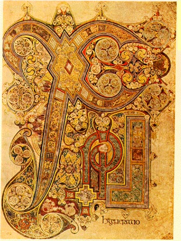
Vera "Celtic" Bradley?
Thinking about current artwork and design it can be difficult to think of things inspired by celtic artwork other than straight celtic designs done currently, such as jewelry and other things. Vera Bradley bags have always somewhat overwhelmed me with their intricate curly designs. I got the same feeling of overwhelmed-ness (definitely not a word) when I looked at the Celtic manuscripts. I think the repeating, overlapping patterns are reminiscent of these illustrations.
Subscribe to:
Posts (Atom)


