Monday, May 9, 2011

Final Part 2


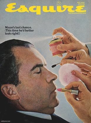
This cover of Esquire is known as one of the best magazine covers of all time, and I believe that is because it is interesting to look at without knowing the background or reference it is making, but when you do know the reference it is extremely interesting. The cover is referencing the stort of Saint Sebastien. The painting below by Andrea Mantegna is one of the most famous images of the saint. 
Sebastien is the patron saint of athletes, among other things, who was shot with arrows for his beliefs. The cover is comparing Ali to this saint who never gave up on his beliefs, although he was seriously persecuted for it. When you know the story behind the image it is extremely powerful. A similar example for today's society is the following cover of Rolling Stone: 
This is an obvious comparison of Kanye West to the most recognized image in the world, Jesus with the crown of thorns. Both of these covers show these contemporary icons with a reference to past icons. It is more than just looking like the person, it has to do with the beliefs that the person has, not necessarily religious, but the amount of passion these people have for what they do is enough that people may compare it to a religious figure. I believe the Esquire cover is less recognizable and not as easy to connect the story to the image, because I would not have instantly known that it was referencing Saint Sebastien, however in the case of the Kanye cover it is an instant read that it is referencing Jesus, also the text that says the passion of Kanye West makes it clear that they are not calling Kanye a religious figure, just that he is extremely passionate. Although the text does help the understanding, it makes the image not as powerful. The starkness of the Esquire cover makes it stand out. They are both extremely interesting and make strong statements about current icons and their beliefs. 

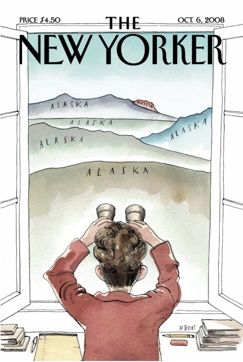
This image from 2008 of Sarah Palin uses images to make fun of her statement "They're our next door neighbors and you can actually see Russia from land here in Alaska." Which was more famously spoofed on SNL with the statement, "I can see Russia from my house!" This image makes fun of her intelligence, or perceived lack thereof. I believe that although this image is summarizing that whole thing, the more powerful image that comes to mind when I think of Sarah Palin is Tina Fey's impersonation of her, and I think that although it is not a image in the traditional sense, it is more comparable to the point made in the Nixon portrait, questioning the candidate's norms. In the Nixon Portrait it is saying he is concerned about image, but Fey's impersonation of Palin really pokes fun at Palin's intelligence, and makes her seem really really dumb. Both that and the cover question her reliability as a candidate. 

Sunday, May 8, 2011

Lester Beall posters


I tried to make my posters as simple as possible, in keeping with Lester Beall's aesthetic. I loved the integration shown on his posters where the photography and bold graphic elements intertwine, and I wanted to bring that relationship to my posters. I made two just because I thought it would be interesting to make it look like somewhat of a series. I kept the colors simple at just red white and blue, but I really wanted to get across the point that it was all about america and keeping together as one united country to help our neighbors. 
Also, I posted it on my personal tumblr.

Wednesday, April 20, 2011

Bill Steber at Chromatics

I went to see the Bill Steber show at Chromatics, which had some amazing black and white photography. The quality of light and darks he got in these prints are breathtaking. The internet really does not do them justice. Most of them were  Silver gelatin prints on fiber base paper, so the quality of them is just outstanding. I love that he captured of the fun dancing side of blues, like the one above, and the introspective soul of the music, seen in some of the more subdued shots like the portraits below.

William Eggleston at the Frist

This image was one of my favorites on display the Frist when the Eggleston exhibit was here. I thought his style was very interesting. He seems to like to make images that make you feel as if something is just slightly off, or atleast that is the feel that I got from it. It's like all of his images are familar and are things that you might see on an every day basis, but he makes them seem somewhat foreign and strange with his straightforward shots and layouts. My favorite part was the music packaging in the middle, it was interesting to see his photography applied to a less fine art setting and how it functioned in the design. 

Monday, April 18, 2011

I used the below images to create my poster.


Here is my poster:
I decided to do a poster for bongo java, because since we are all Belmont students, obviously we all might as well have our own beds there. I know personally I spend way more time and money than I should there. I am always interested by the assortment of people that are there. I love seeing the business people sitting 2 tables away from dirty kids with dreds that are skipping high school. When I was looking through all the posters I was intrigued by all the different characters that were in the posters. I wanted to be able to tell a few different stories with my poster, yet have it focused on one. I wanted it to be simpler so I kept the colors as the yellow, orange, deep green and beige colors that were very common in the posters I was looking at.
The 10 aspects of Art Nouveau that are evident in my poster are:

1.Simple bright color palette- I only used about 4 colors to create my poster, this is like the art nouveau movement because in many of the posters they only used a few colors and kept them very flat. All of my colors are flat except for the background, in keeping with their style. 
2. Flattened space- Going along with the flattened colors, the space is flattened out in my piece. Although there are people behind the main man, the pattern really flattens it out. Many of the pieces from this period of time show the patterning in the background to flatten the space, for example the Inland Printer piece I used is very flat because of the heavy use of the pattern. 
3. Organic Lines- It is very rare that you would see a straight line in art nouveau posters, they loved the organic and nature inspired shapes. Since I took all of my figures from different prints, they obviously carry over the organic lines aspects of it. Even the table, which should be straight is clearly hand drawn, therefore having slight imperfections. 
4. Patterning- The background is heavily patterned because of the use of patterns in art nouveau. Artists liked using patterns in their work, especially patterns drawn from nature, like the one in my background. It makes it a little more interesting than just flat colors everywhere. 
5. Focus on one individual. Although there are many figures in mine, the clear focus in on the man in the front. In traditional Art Nouveau the focus is normally put on a main woman. If you look at the prints I cited, especially the Lautrec one with the woman in black you can see that aspect of things going on in the background but the clear focus being on one person.
6. Female forms- Although my main character in mine is a male, there is definitely the use of female forms like Art Nouveau posters. They loved the female form and loved the curvy lines and organic shapes created by a woman's outline. This is especially evident in my use of the Lautrec print with the couple. The girl's back is not normally shaped, but it is still very beautiful to the eye because of the extreme curve. 
7. Bold outlines- I kept the bold outlines on the man to stay true to the style Lautrec most commonly showed, where the shapes are defined by outlines rather than color or shading. Although the male figure is not a Lautrec piece it really has emphasis on the outlines. 
8. Symbolism- The art nouveau movement liked the use of symbols, for example a woman never was just a woman in their prints, she either stood for a group of people or was a specific character that had meaning. All of the characters in mine are symbols of the different types of people one would see at Bongo, I wanted to represent many different types of people. 
9. Slight abstraction- The individuals in this poster are obviously not photorealistic representations of people. The art nouveau artists seemed to slightly abstract and generalize human forms. This is consistent in my piece. 
10. Floral/Plant decoration- In the art nouveau movement and especially the arts and crafts movement, there was a longing for nature. Many people had a fresh passion for nature and the beauty that exists outside of cities because of the industrial revolution and the overwhelming shift toward everything man-made. Artists used these floral patterns to create that more natural look, this is shown in my background.
1.

Friday, April 1, 2011

I loved all the pictures of the chromolithography. I thought the posters were extremely interesting, and I thought it was pretty awesome that they made color printing so easy. It was quite an innovation. I think it is really cool to see the quality of colors they used, and how vivid they really are. The hand lettering on a lot of the signs and packages is really cool and really gives it personality. I especially loved the tin packages on page 158, because it totally changed packaging forever. Before that it was only labels put on containers, now the container was the label.

Tuesday, March 22, 2011

Printing Press' effects on books.

We all remember the book of Kells fondly, it was created by Celtic Illuminators in 794-806. The amount of detail put into single pages is breathtaking. For example the page on the left, from the book of Kells has astounding amounts of detail. There was a distinct Irish style in the book of Kells that made it extremely interesting to look at. There is intricate knotwork and a lot of colors and unique shapes that are obviously formed by a skilled artist. This book would have been an extremely special object to own. Illuminated manuscripts weren't just books that you threw around and took notes in, like the way we think of books today. They were heirlooms. They were extremely important. These illuminated manuscripts would have been produced in a scriptorium with illuminators spending months and months on the book. The individuals doing the actual writing of the pages would be kept busy doing that while more skilled illuminators would just work on making the pages look beautiful. The font style they used in these manuscripts was caroline minuscules, they were extremely rounded shapes that ran together. If you look at image 4-10 in the book on page 51 you can really see that the words run together and are not extremely legible. It looks a lot like handwriting, and that's because it was done by hand. The typefaces very between each manuscript.
Another example of illuminated manuscript, or books before the printing press would be the Beatus of Fernando and Sancha. It was from Spain, in 1047. The Spanish manuscripts had a distinct style of bold colors and less intense detailing. The image on the right is part of a page that we can also see in our textbook. It is image 4-14 in the text, on page 53. In the textbook it has words underneath it. The letters are more geometric than the Irish type. The words are less uniform and look more handwritten, but seem to be slightly more legible than the The Book of Kells. Spanish design was very different because there was a mix of cultures between the Moors that settled in Spain and Islamic designs and Christian ideas. The use of bold colors makes their designs extremely interesting, even today. Books like this were not just commonplace in that time. The people illustrating these books were highly skilled, just like the Celtic illuminators.

Then it all changed. People started doing block prints, made from carving out negative space from a block of wood. The first ones weren't especially impressive, but as people developed their skill at carving blocks the prints became better and better. Woodblocks allowed for faster printing. In the year 1450 A man named Johann Gutenburg developed an extremely complex system to print a book. He has metalworking and engraving skills and put them towards his knowledge of printing. The reusable type could not be made out of wood because it would not hold up, but the metal worked very well for the just-beginning printers. In the beginning of type people liked typefaces that mimicked the handwriting commonly used in manuscripts. When printing was first being developed books were still special objects. An example of Gutenberg's printing can be seen here on the left, this is Gutenberg's bible from 1450-1455. The letters are more uniform, and it is more legible than the original manuscripts. There is still illumination, or illustration being done on the type, but not as much as there used to be. In old hand illuminated scripts the illustration would interact with the text a lot, and in this it definitely stands apart from the text. This also shows that the role of the illuminator changed, from doing large pages of illustrating or embellishing hand done text, it became more about adding color or small pictures to blocks of text.

Someone who helped out the business of printing was Pope Julius II. He was interested in typography and the art of writing. In 1492 he ordered scribes to hand letter a book of typography for his library.  He was a man that really helped push along the renaissance and helped fund many arts, and printing and type were no exception. Although there was still some scribes doing lettering by hand, the demand for them went down after the development of the press. Some scribes were extremely against printing, in Genoa scribes even banded together and tried to get printing banned. Scribes and artists were sometimes necessary for the process of bookmaking to help draw up layouts and ideas for printed books, but the idea of the scriptorium changed completely. Books became more and more abundant, but it was taking less people to make them. The printing press allowed for ideas to be spread much faster than before, and therefore many more people learned how to read. Literacy went up, simply because there was more information being spread through printed word. One idea that was spread rapidly through the printing press was Martin Luther's 95 theses. After he hand wrote them out and posted his issues with the church on their door, the ideas spread because someone printed them, which contributed to the protestant reformation. Having that communication between people nationwide helped them organize. When the printing press started becoming the standard of book-making the art definitely developed. The text became more and more legible and it became more standard. It also aided in communication between nations, because the type became more universal. Although there were differences between each country it was more individual difference between artists than huge difference between countries, like we saw earlier between Celtic manuscripts and Spanish manuscripts. Woodcut illustration also took huge leaps and bounds. We can see here above and to the right, Albrecht Durer's Rhino print from 1515. He created volume and depth with his woodcuts, he became well known for his prints. He became well versed in renaissance ideas because he traveled around a lot. He helped influence ideas in Germany by bringing back things he heard in Italy. There was definitely more communication between people groups and spreading of ideas. German printers continued to develop printing and the book. Someone else who contribuited to the German book was Lucas Cranach the Elder. He introduced uniform type, so the idea of uniform and universal type was spreading.
Italy became more and more interested in printing, and in 1465 Cardinal Turrecremata invited Sweynheym and Pannartz to publish his writings and some classics. They designed types for his writings that built upon Roman letterforms. They also created a double alphabet, using capitals and lowercase(see image at right), which is the type of writing we use today. Obviously as we have gone on the type of detail and illustration we saw in the Book of Kells is not seen any more, and the book has become more and more of a commodity. By no means could everyone read, and not everyone had books, but more and more people had them and were reading.

French bookmaking took what everyone else was doing but added more flourishes, for example here we see Pigouchet's book of hours from 1498. He used a denser more gothic text, and took advantage of the borders and added a lot of detail and ornaments. Some of the best scriptoriums were in france. They integrated with illuminated manuscript style. It was more intricate than most other counties books. They also used more fine lines and Pigouchet developed "crible" technique where you punch holes into the wood to create tones. Although books were not special heirlooms anymore they were still very interesting to look at and extremely important to people, more as a way of communicating, even between counties than anything. Although we didn't have the same division of styles as stark as we did in the illuminated manuscripts you can still see how there were definite difference at least between individual printers, which kept the art of printing from becoming completely unified and the same, but as we can see now in any book store, that did not last. As time goes on type has become more and more universal and we can credit that communication and ease of spreading ideas to these early printers.